Table of Contents
In today’s data-driven world, the ability to convey complex information through data visualization and storytelling is invaluable. For information technology engineers, mastering this skill can be a game-changer, enabling clearer communication, better decision-making, and more impactful presentations. Let’s dive into how data visualization and storytelling can transform data into compelling narratives that resonate with your audience.
The Power of Data Visualization
Data visualization is more than just creating charts and graphs. It’s about making data accessible, understandable, and actionable. Effective data visualization turns raw data into visual stories, allowing you to highlight trends, patterns, and outliers that might otherwise go unnoticed.

Why Data Visualization Matters
- Clarity and Comprehension: Visuals simplify complex data, making it easier to grasp.
- Engagement: Well-designed visuals capture attention and hold interest.
- Decision-Making: Clear visuals facilitate quicker, more informed decisions.
Key Principles of Data Visualization
- Know Your Audience: Tailor your visuals to the knowledge level and interests of your audience. For IT engineers, this might mean incorporating more technical details.
- Choose the Right Chart: Use the appropriate chart type for your data. Bar charts for comparisons, line charts for trends, pie charts for proportions, etc.
- Keep It Simple: Avoid clutter. A clean, straightforward design enhances understanding.
- Tell a Story: Every visual should support the narrative you’re building.

Storytelling Through Data
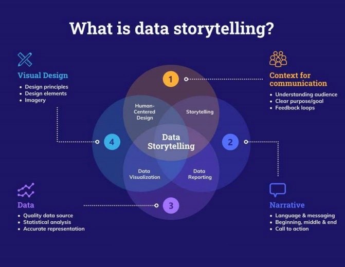
Data storytelling combines data, visuals, and narrative to communicate insights effectively. It’s about framing your data in a way that tells a compelling story.
The Elements of a Good Data Story
- The Hook: Start with a compelling question or statement to draw your audience in.
- The Data: Present your data in a logical flow. Use visuals to support your points.
- The Insights: Highlight key takeaways and insights.
- The Action: Conclude with actionable steps or recommendations.
Real-Life Example: Enhancing Network Security
Imagine you’re an IT engineer tasked with improving your company’s network security. You have data on past security breaches, including the time of occurrence, type of attack, and response time. Here’s how you could visualize and tell this story:
- The Hook: “Did you know that our network faces the highest number of attacks between 1 AM and 3 AM? Let’s explore why and how we can strengthen our defenses.”
- The Data: Use a heatmap to show the frequency of attacks at different times of the day. Follow with a bar chart illustrating the types of attacks.
- The Insights: Highlight that most attacks occur during off-peak hours, suggesting that the attackers exploit lower monitoring levels. Show a line graph of response times, indicating a delay during these hours.
- The Action: Recommend increasing monitoring and staffing during vulnerable times. Conclude with a plan for implementing stronger defenses.

Tools for Data Visualization and Storytelling
Several tools can help you create stunning data visuals and tell compelling stories:
- Tableau: Great for interactive and shareable dashboards.
- Power BI: Integrates well with Microsoft products and offers powerful analytics.
- D3.js: A JavaScript library for creating custom data visualizations.
- Google Data Studio: Ideal for creating reports and dashboards linked to Google Analytics.
Conclusion
Data visualization and storytelling are essential skills for IT engineers. By transforming data into clear, engaging, and actionable insights, you can drive better decision-making and communicate more effectively with your audience. Whether you’re presenting to stakeholders, collaborating with colleagues, or improving your own understanding of complex data, these techniques will elevate your work and impact.
So, next time you face a mountain of data, remember: visualize it, narrate it, and watch how it transforms your story. Happy visualizing!
By incorporating these elements into your data visualization and storytelling practices, you’ll not only enhance your technical presentations but also ensure your message is clear, compelling, and actionable. This approach not only improves comprehension but also drives impactful decisions, making your role as an IT engineer even more vital to your organization’s success.


Leave a Reply